My reason for Blogging:

I'm Joe Sanders, currently an Undergraduate Landscape Architect Student in my 3rd year at Kingston University. This blog records my own experiences within the field of Landscape and related topics, all shared online to encourage myself and others to gain a wider experience of 'Landscape'.

Thursday, 2 December 2010

Landscape Photographer of the year


 'A landscape image cuts across all political and national boundaries, it transcends the constraints of language and culture.’  - Charlie Waite

Landscape Photographer of the year is a public competition, anyone throughout the British Isles can enter and the selected images are published as a book and also exhibited at the National Theatre in London. Charlie Waite formed the idea for the competition,  a well respected Landscape photographer who's images hold great depth and exhibit ''rare perfections of light, colour and composition'' as stated in a recent article by the Royal West of England Art Academy. The exhibition at the National Theatre runs for 8 weeks and is free so is well worth the visit.  The idea for the competition is a great theme, encouraging people to experience breathtaking landscapes all across Britain.
The winning photograph of 2010,  taken by Antony Spencer of Corfe Castle in Dorset. Image sourced from http://www.whatdigitalcamera.com/imageBank/l/LPOTY_AC_0005864_Spencer_A5_300ppi.jpg

From 2009's competition taken by Claire Carter in Snowdonia Wales. Image sourced from http://www.whatdigitalcamera.com/imageBank/t/TAV_AC_0001858_Carter.jpg


Again from 2009's edition, taken under Brighton Pier in East Sussex. Image sourced from https://blogger.googleusercontent.com/img/b/R29vZ2xl/AVvXsEiWgbyM-KiyCRQcbMNb_bUDasvu3T7Y4GvNXtjy7tBz1LMXueibY1TXU-WICFXjgHhVHBGNV403zBZdCN-JH-AfsVyiaLSwneD6zndDs7hSigq7t6h5ckcVWO-qwUGFQgo4pNUvqQSc0Dc/s1600/Screen+shot+2011-01-16+at+16.51.04.png. Structures that are surrounded by water and have been aged by the elements hold a great character, a sense of this is revealed within this picture. The way the low sun has caught all the ropes and rags has really brought out their colours and textures in a striking way.

Kew Gardens


A Visit to Kew Gardens in late autumn.  The Royal Botanic Gardens, Kew is situated in London just north of Richmond Park, it is most importantly a scientific instituition. Huge collections of plants, preserved and living along with botanical information has formed Kew into a centrepoint for knowledge within the plant world.

Prunus Taihaku, Great White Cherry Tree


The Sackler Crossing designed by John Pawson, See my previous Post on John Pawson for more info on this design.

Sorbus Commixa, Japanese Rowan Tree

Larix Kaempferi, Japanese Larch

Avenue of Larches, this stunning golden yellow together with the sunlight from the side was a beautiful sight.


The Xstrata Treetop Walkway, It was designed by Marks Barfield Architects, who also designed the London Eye.  This is an 18 metre high structure, with a footpath the encircles a canopy of trees for 200m. The woodland this walkway cuts through consists of Lime, Sweet Chestnut and Oak trees. Cortens steel has been used with great strength, a material that blends well with a natural environment, each complementing one another. Creating the opportunity for visitors to go up to the canopy to be able to see into the tree enables one to understand the habitats that exist and get much closer to nature. The structure has a powerful dominance within this landscape however from ground level it is not an interference to the beauty that surrounds. On a critical note I feel the design would have been more intriguing to experience if it crossed a more diverse topography across the ground, running for longer throughout a variety of woodland types would have been exciting to experience.
Something that is particularly enjoyable throughout this design is the attention given to the joints. Elegant details such as this complete the experience of such a structure.
This video shows some of the making of the Xstrata walkway and how they altered the existing surrounding to suit it. Video sourced from http://www.youtube.com/watch?v=nP5gprVe0nM&feature=player_embedded

Interactive Lighting - Dover Yard Shortcut


A well used pedestrian route in London called the Dover Yard links Berkeley Street and Dover Street, near to Green Park.  An interactive lighting display has been installed within this shortcut, designed by Jason Bruges and his team.  Jason Bruges specializes in creating site specific installations and interactive spaces, finished with a quality that enhances their environments.

The artwork installed within Dover Yard has transformed this linking route into a safe alley. The LED uplighters run along one side recessed into the paving, set at a dim level however still illuminating the walkway. When people move through this pathway sensors detect them and the lights increase in intensity, following the pedestrian through the route. This movement of light within the space has encouraged a more confident use of this shortcut, people are intrigued to see the light trace their movement. Something I found aesthetically very pleasing within this space is how the angle of light hits the textured bricks of the walls. When they are fully illuminated as people pass by the light creates stark contrast between the light and shadow of the bricks, thus exaggerating the topography of each brick. The quality of environment created within this space becomes especially enhanced as England gets closer to winter and the darker nights set in earlier, in time for the people finishing work to experience 10 seconds of moving through this useful link.
 
This Video embedded from Jason Bruges website reveals how the space is effected by these lights.

John Pawson at the Design Museum

 John Pawson recently exhibited a selection of his architectural achievements at the Design Museum on London. He runs a practise based near Kings Cross of about 25 people and together they have worked on a variety of projects from houses and galleries to bridges and boats. The unique architectural style composes clean spiritual environments. His work reflects a modernist approach using limited colour and simplified forms, offering a sense of refuge within.

Through exploring the qualities of the landscape that his architecture is to occupy, Pawson creates a clear understanding of his limits; this is felt strongly within his projects.


Pawsons home in London, created in 1999 is within the walls of a 19th century house.  The kitchen worktop runs seamlessly through a glass wall uninterrupted into the garden, this is a distinct feature that creates one space.  I am really intrigued to know how differently I would function in a house like this,  where there is such little clutter.


The Sackler Crossing, Designed by Pawson for Kew Gardens is a of a poetic form.
Granite has been used for the deck, laid like railway sleepers with cast bronze raising up between each set of granite on either side of the bridge creating the edges. These Bronze forms are set in such a way that from the side they do not obstruct the view and impose on the physical aspects of the lake scene, however when you cross the bridge they face you thus giving the impression of a strong edge. The bridge is set low across the lake with only two supporting points to the lake bed, this low position and natural curve of the design create the impression that the footpath ‘floats’ above the water as it crosses the lake. It is a characteristic design but I feel its visual effect has been assessed and balanced well with the surrounding, sensitive landscape.


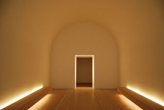
This space within the Design Museum is Pawson’s site specific response to the space. A single entrance moves you into rectangular room with a 180 degree curved ceiling. Benches face each other from either side and the far wall is a light fabric. This use of material has formed a strange edge, encouraging the eye to see a haze within the room. The dispersed natural light entering through into the interior environment, I feel has created a valuable experience. The curved ceiling together with the benches on either side simulate a Bomb shelter from world war 2, I’m not sure if this has been thought about throughout the design but is an interesting thought as the space is so pure and peaceful.

The Shard