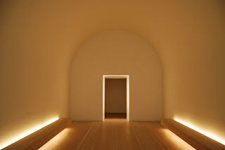
John Pawson recently exhibited a selection of his architectural achievements at the Design Museum on London. He runs a practise based near Kings Cross of about 25 people and together they have worked on a variety of projects from houses and galleries to bridges and boats. The unique architectural style composes clean spiritual environments. His work reflects a modernist approach using limited colour and simplified forms, offering a sense of refuge within.
Through exploring the qualities of the landscape that his architecture is to occupy, Pawson creates a clear understanding of his limits; this is felt strongly within his projects.
 |
| Pawsons home in London, created in 1999 is within the walls of a 19th century house. The kitchen worktop runs seamlessly through a glass wall uninterrupted into the garden, this is a distinct feature that creates one space. I am really intrigued to know how differently I would function in a house like this, where there is such little clutter. |
 |
| This space within the Design Museum is Pawson’s site specific response to the space. A single entrance moves you into rectangular room with a 180 degree curved ceiling. Benches face each other from either side and the far wall is a light fabric. This use of material has formed a strange edge, encouraging the eye to see a haze within the room. The dispersed natural light entering through into the interior environment, I feel has created a valuable experience. The curved ceiling together with the benches on either side simulate a Bomb shelter from world war 2, I’m not sure if this has been thought about throughout the design but is an interesting thought as the space is so pure and peaceful. |

No comments:
Post a Comment